0.3.0-alpha
Summary
Release
https://github.com/polkadot-live/polkadot-live-app/releases/tag/v0.3.0-alpha
Milestone 2 Tracker
View this Milestone 2 Tracker document to see progress on the current roadmap.
New Features
- Flexible side navigation.
- Summary screen displaying key usage statistics.
- Standardized styling convention application wide.
- Toggleable dynamic dark and light themes.
Next Release
The next release of Polkadot Live will likely focus on project structure and more UX improvements. More specifically:
- Migrating to a monorepo setup.
- Releasing an initial Linux build.
- UX improvements and UI additions to the main and OpenGov windows.
- New test suite setup.
New Navigation and Summary
Side Navigation
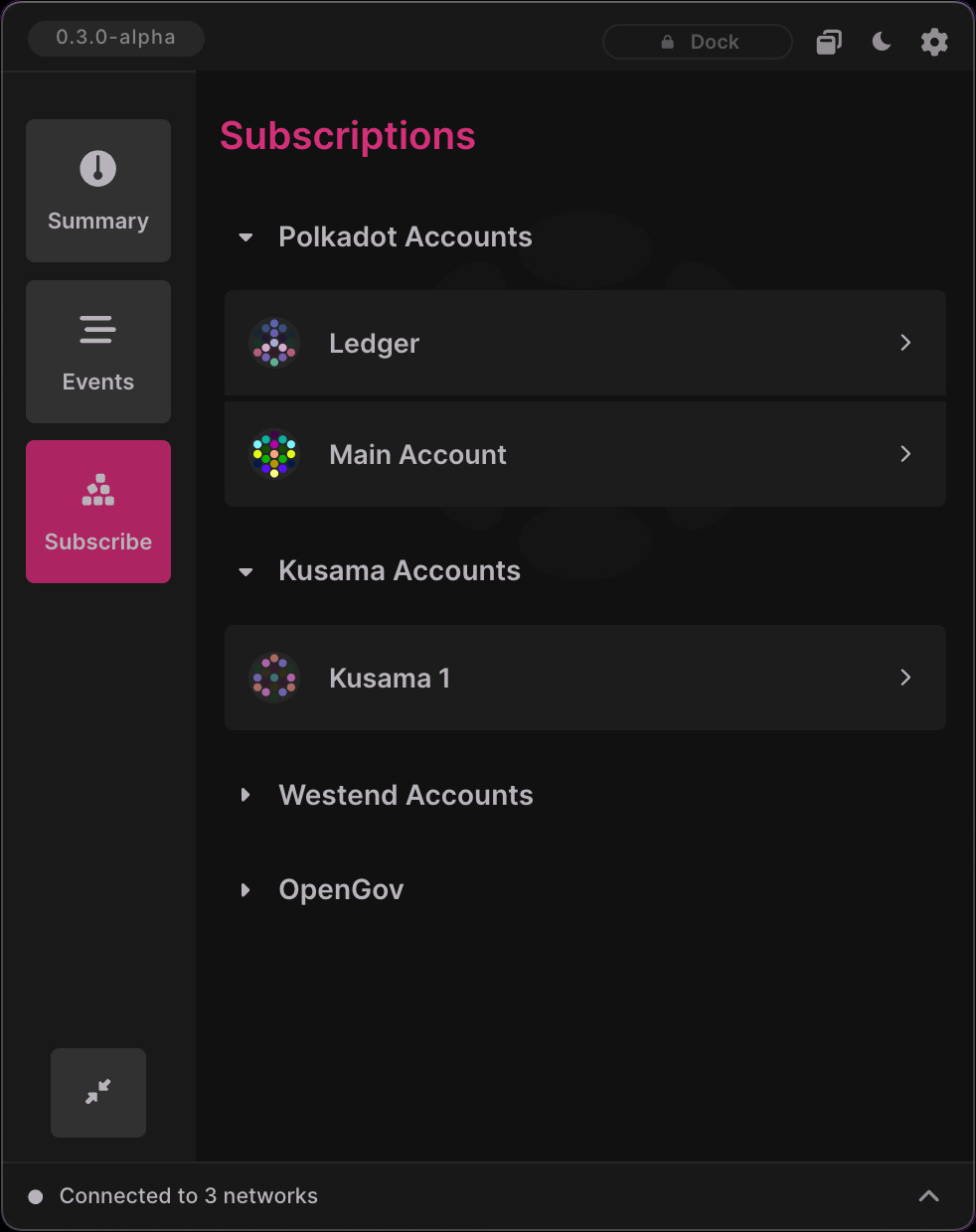
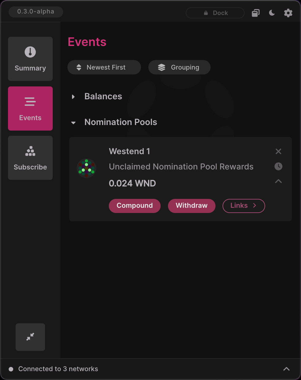
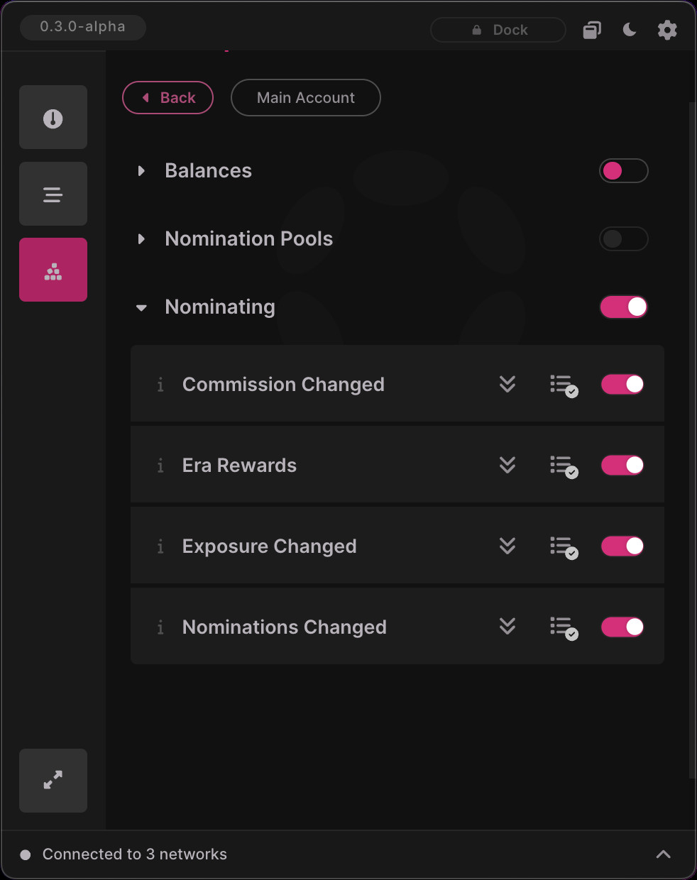
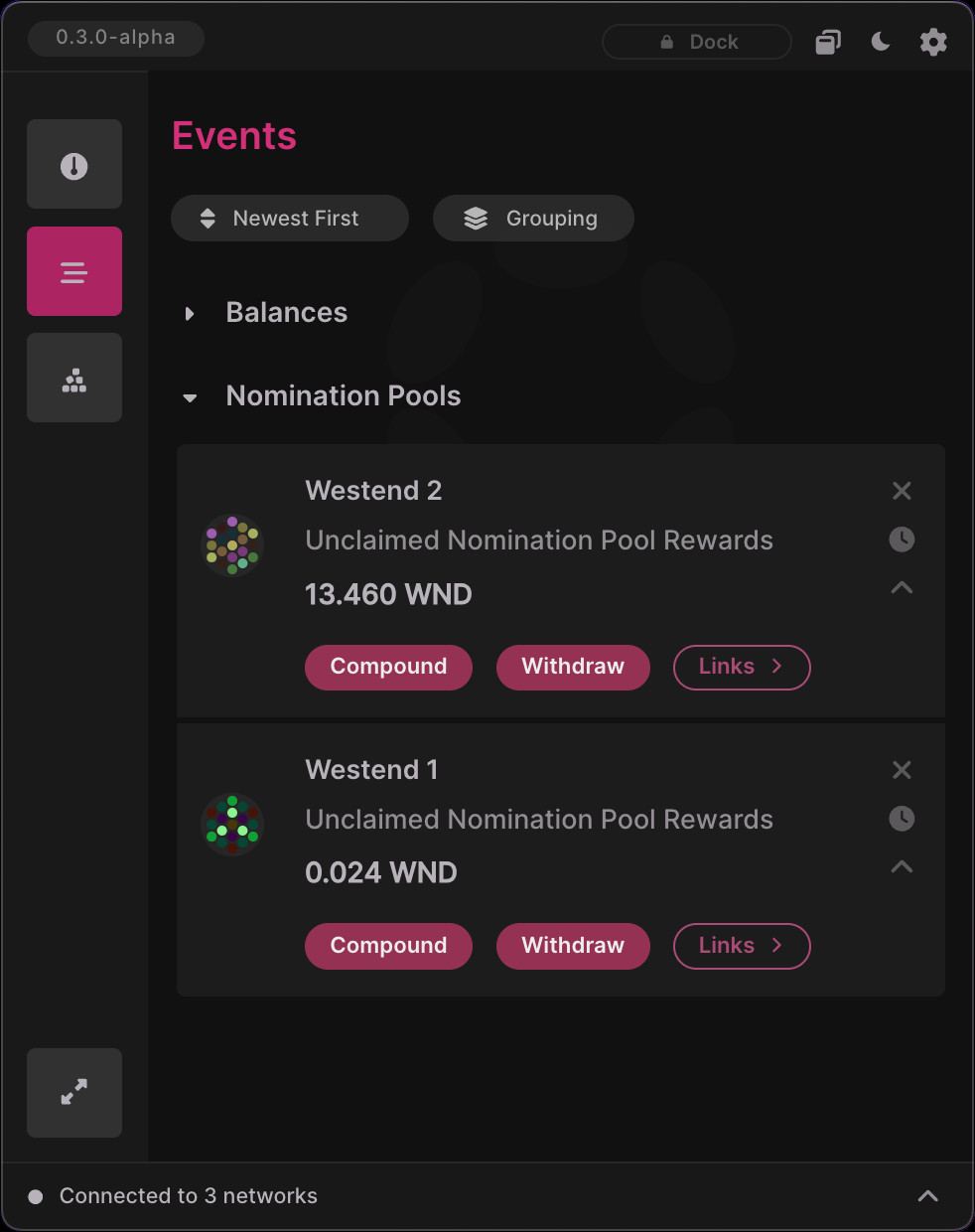
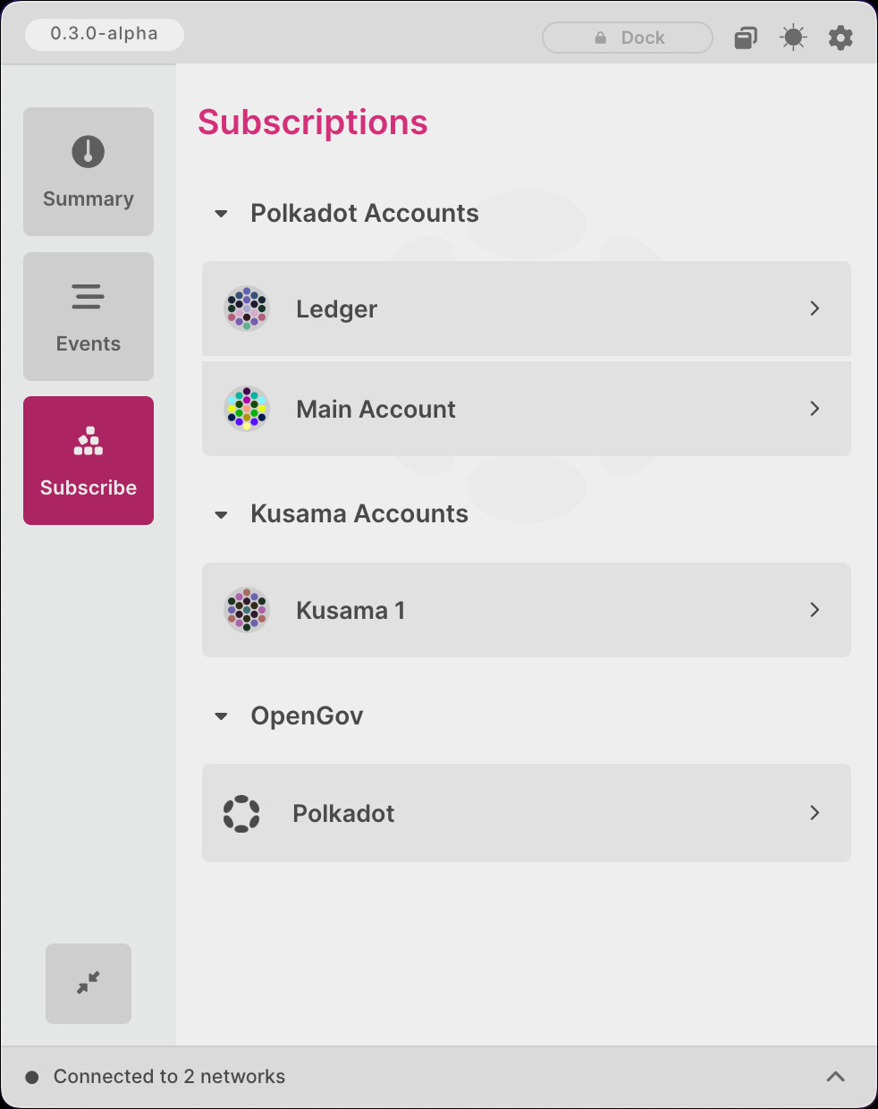
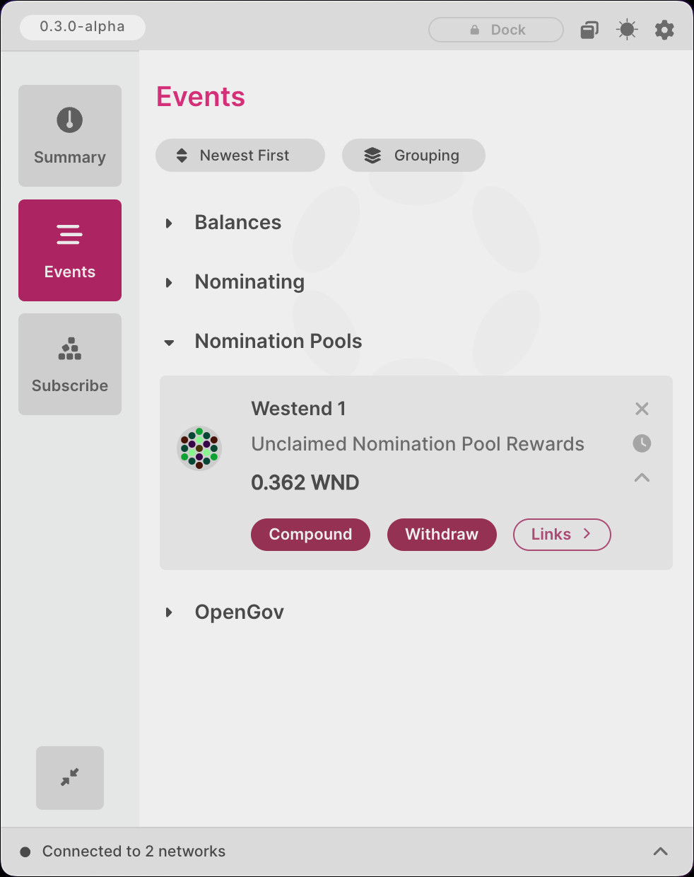
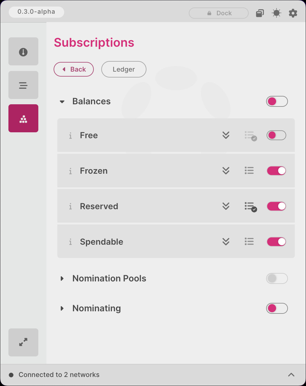
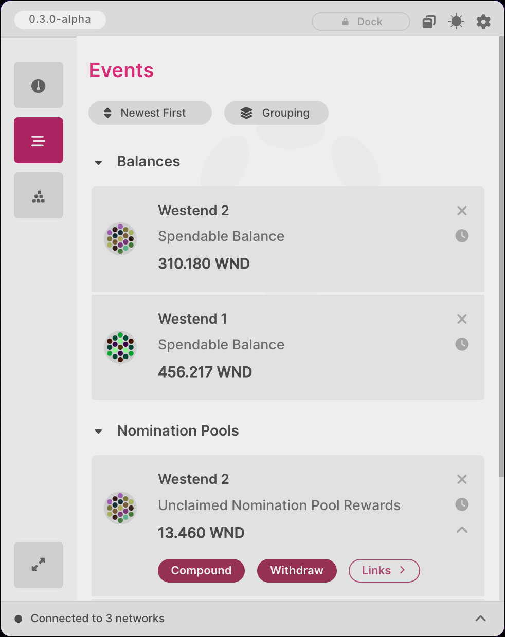
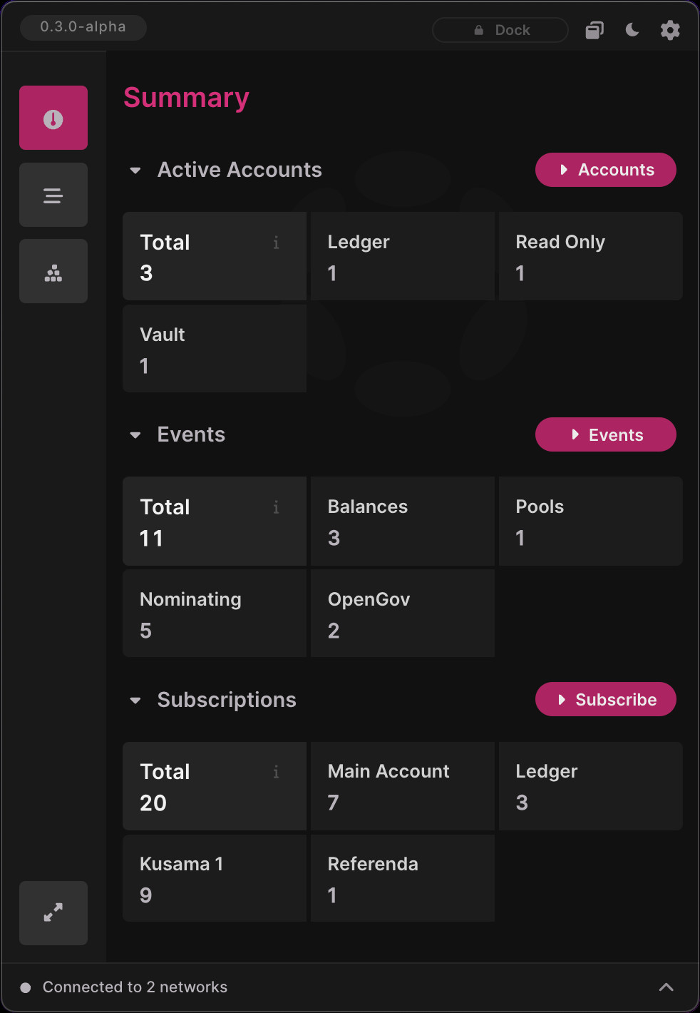
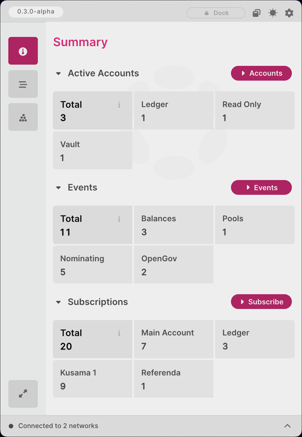
A side navigation bar has replaced the tabbed interface from previous versions, becoming the new way to navigate the main window. The following bullet points provide some key thoughts behind the decision to implement this feature in Polkadot Live:
- Improved UX with smooth button animations and the ability to collapse and expand the navigation bar.
- Room for additional buttons to open screens and child windows as new features are added.
- It's a reusable component and can be added to child windows that require more complex navigation.
- The component will naturally fit into future distributions of Polkadot Live, such as a web extension and web application interface.
The side navigation can be seen in the following screenshots with both the dark and light themes enabled:
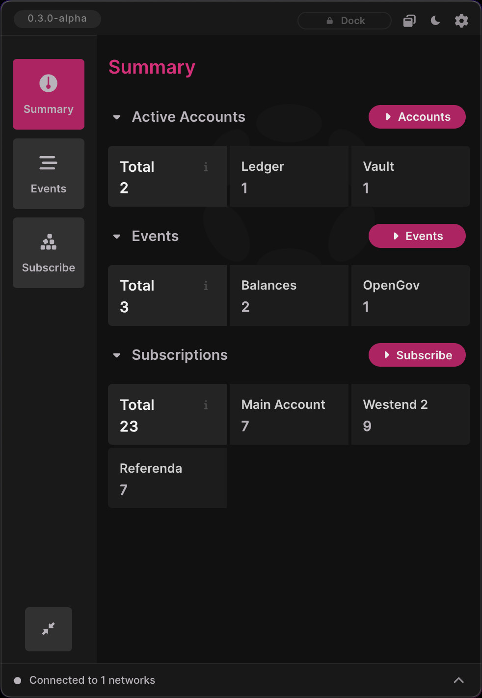
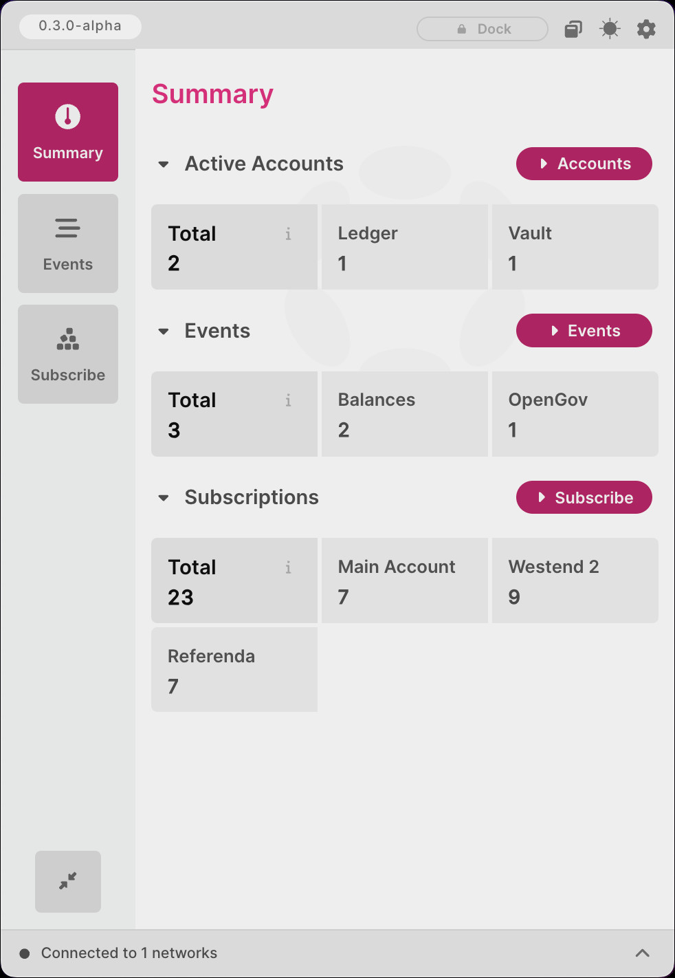
Summary Screen
A new Summary screen has been implemented in 0.3.0-alpha. The goal of this screen is to provide key statistics that relate to your Polkadot Live installation. As such, it allows you to track:
- The total amount of accounts you have imported, along with their import methods.
- The amount of active subscriptions that are enabled for both accounts and OpenGov referenda.
- The total number of events Polkadot Live has received and is currently managing, along with a category breakdown.
Future development iterations will build upon this foundation and improvements will be made as more features are added to Polkadot Live. The summary screen can be seen in the following screenshots with both the dark and light themes enabled:
Merged PRs
View Merged PRs
Standardized Styling
Description
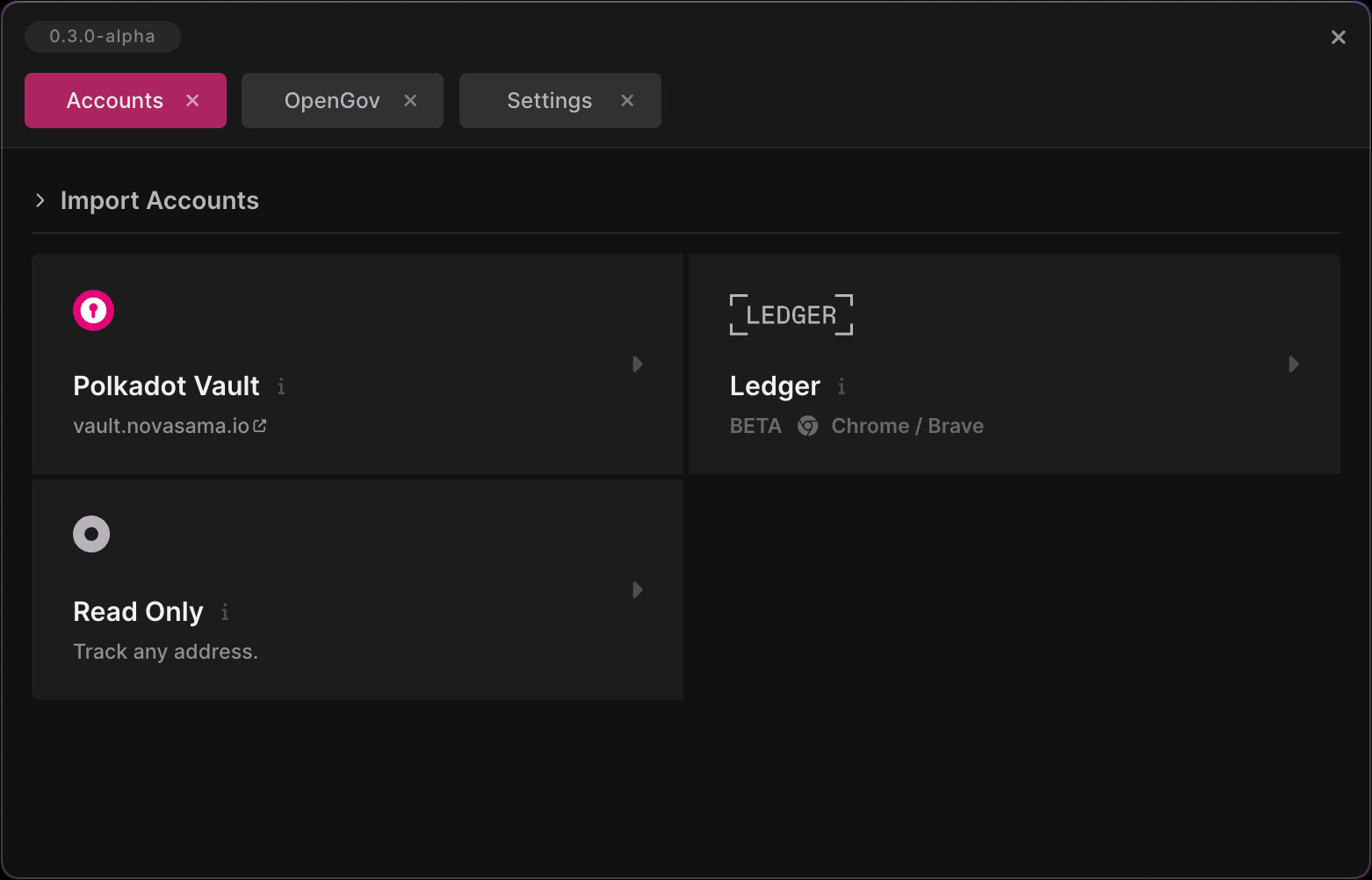
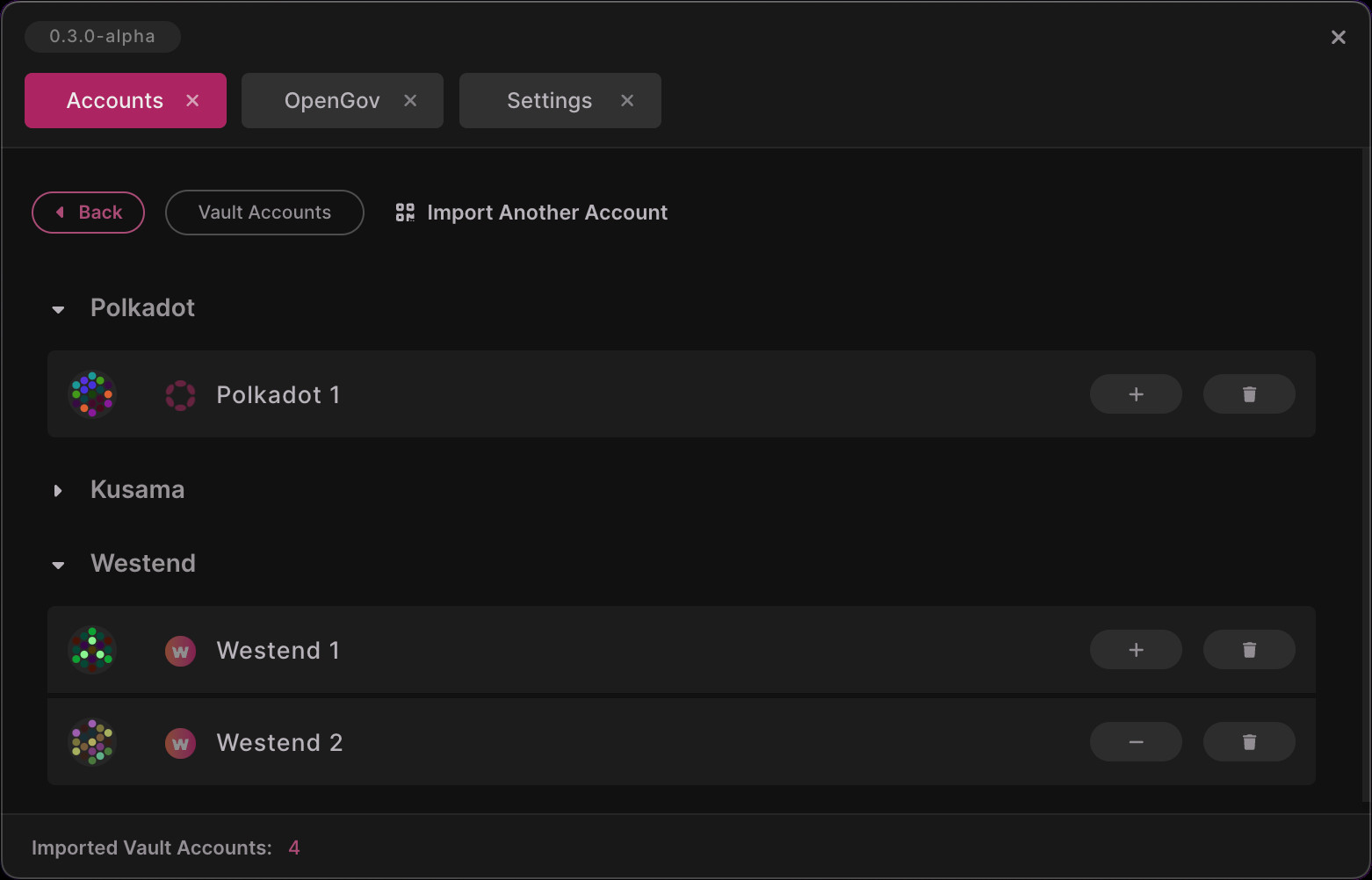
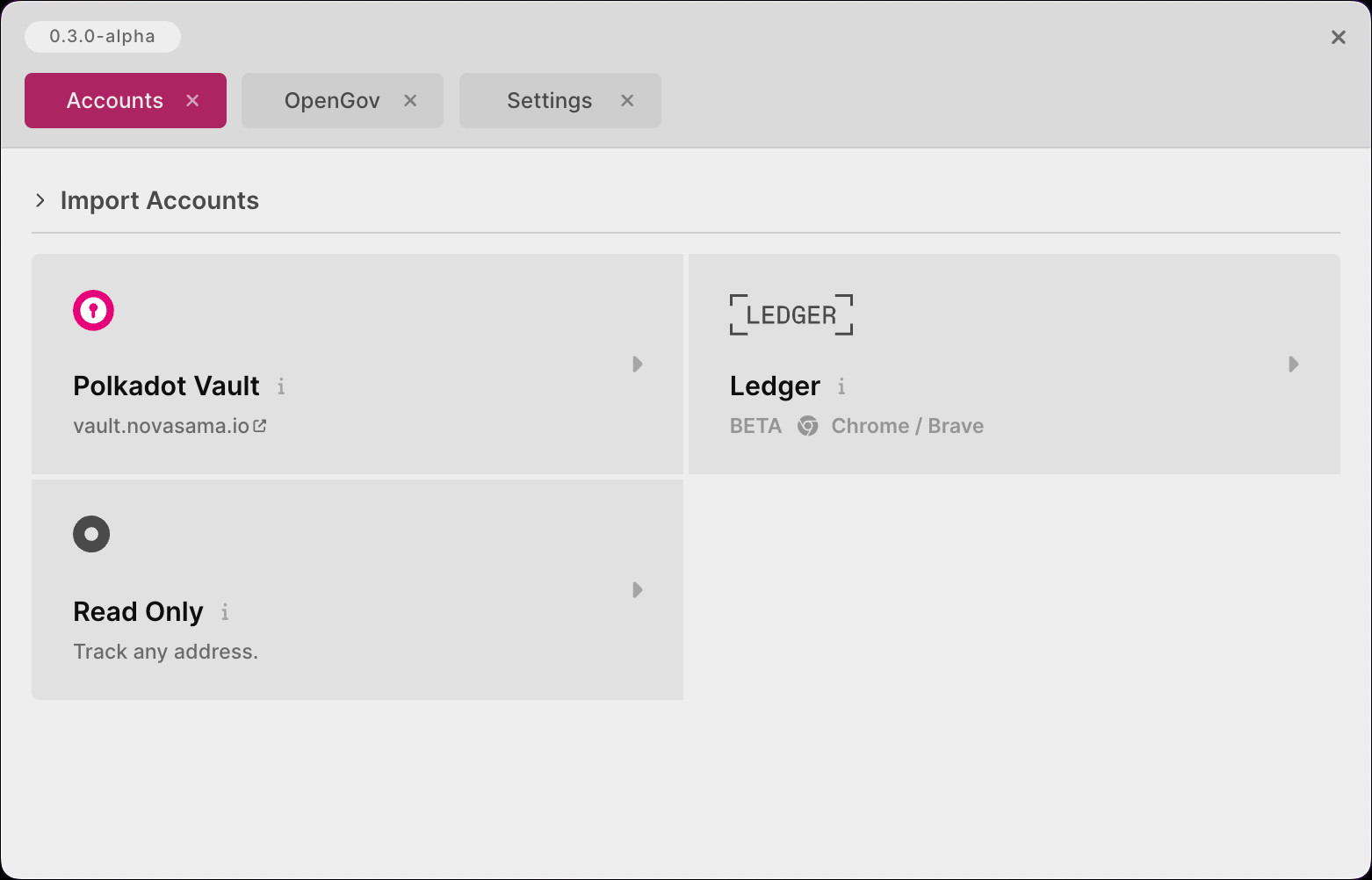
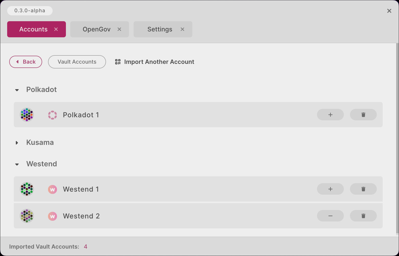
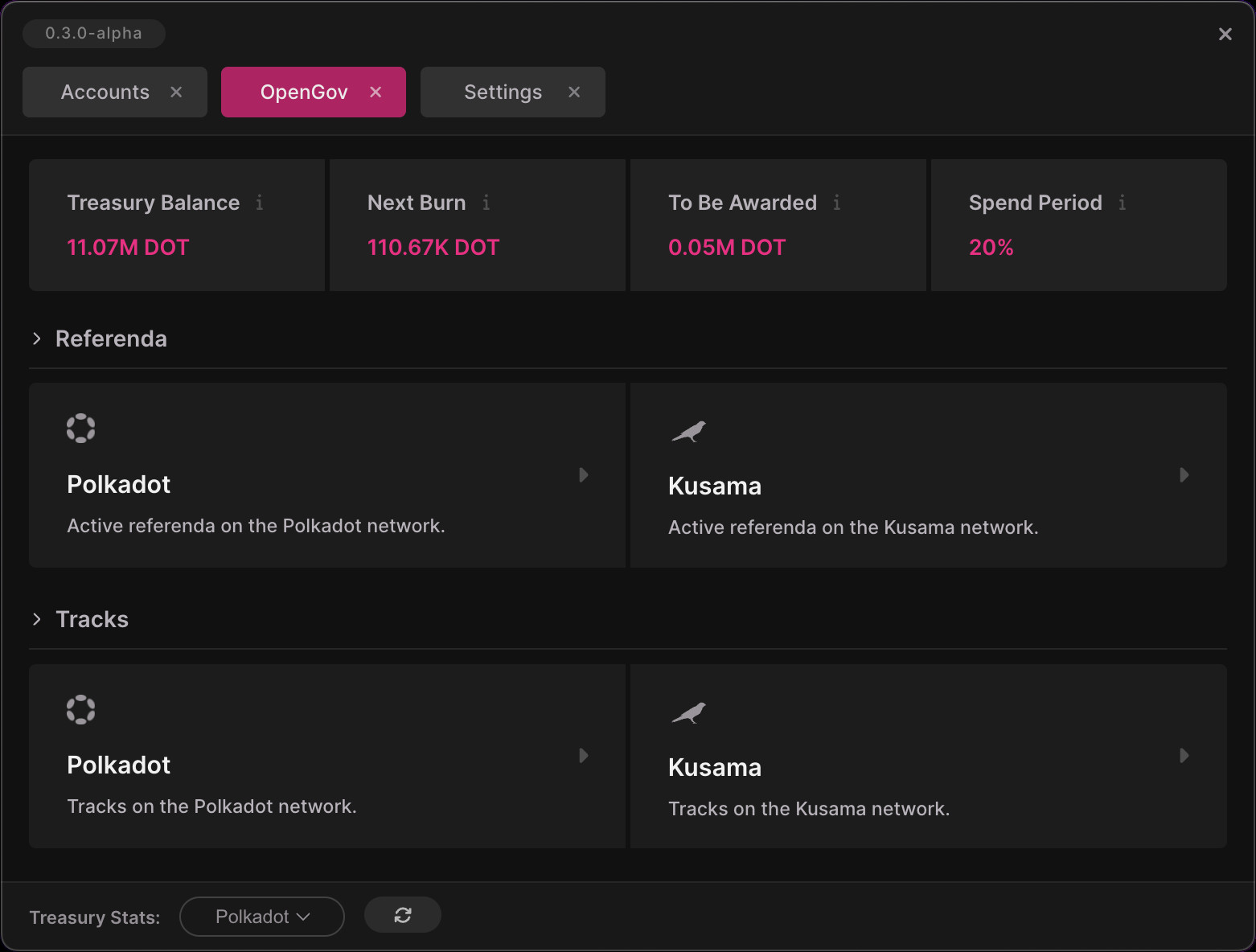
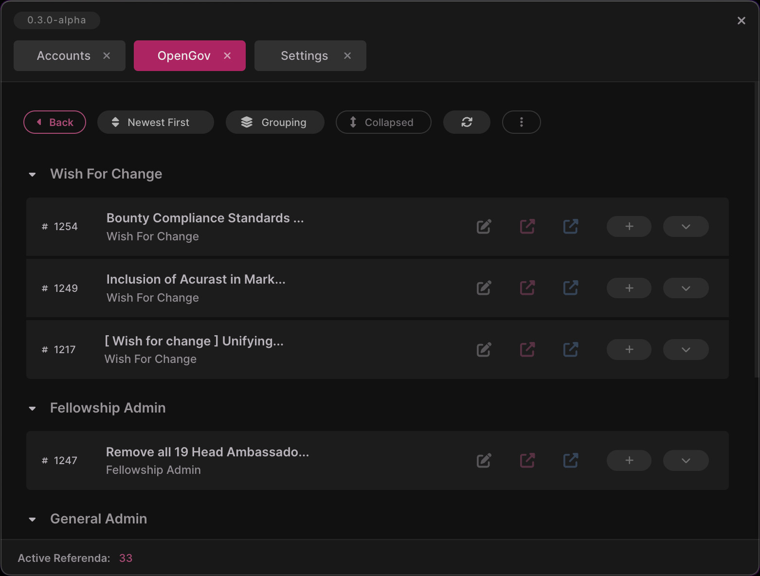
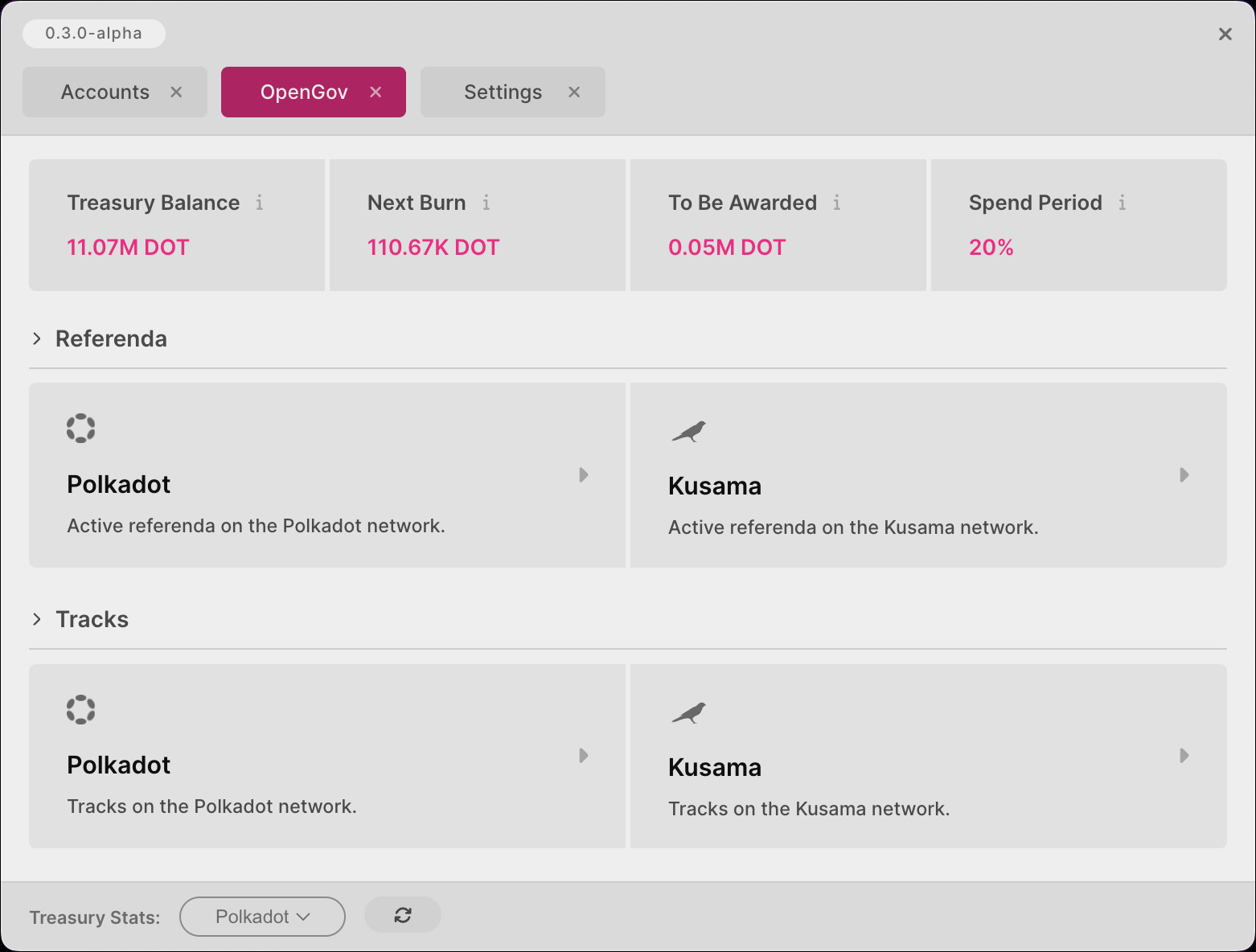
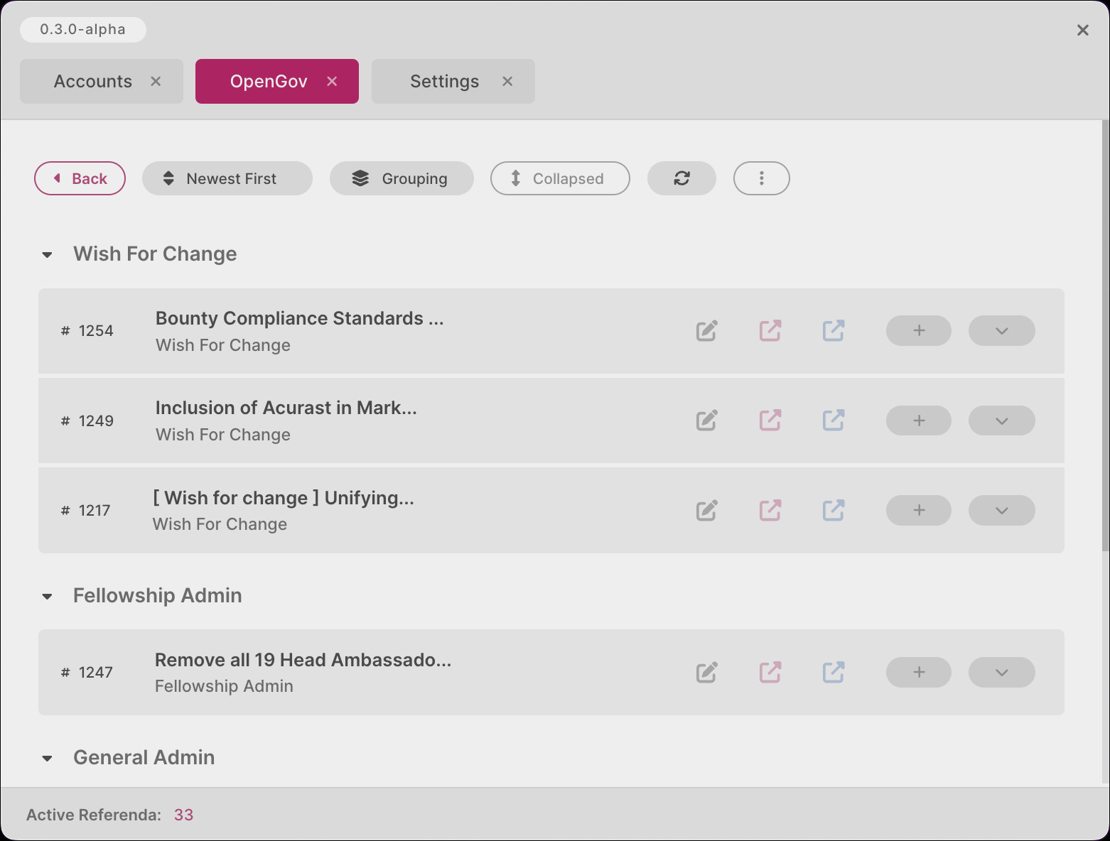
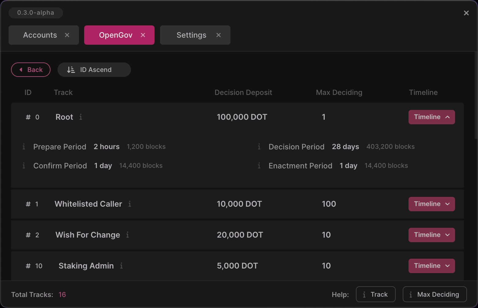
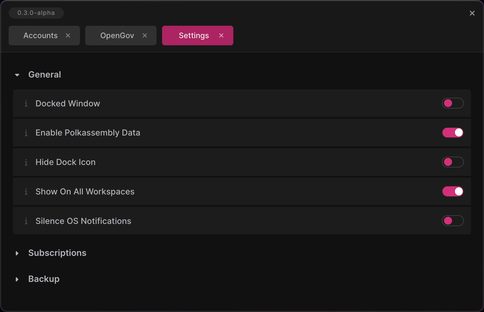
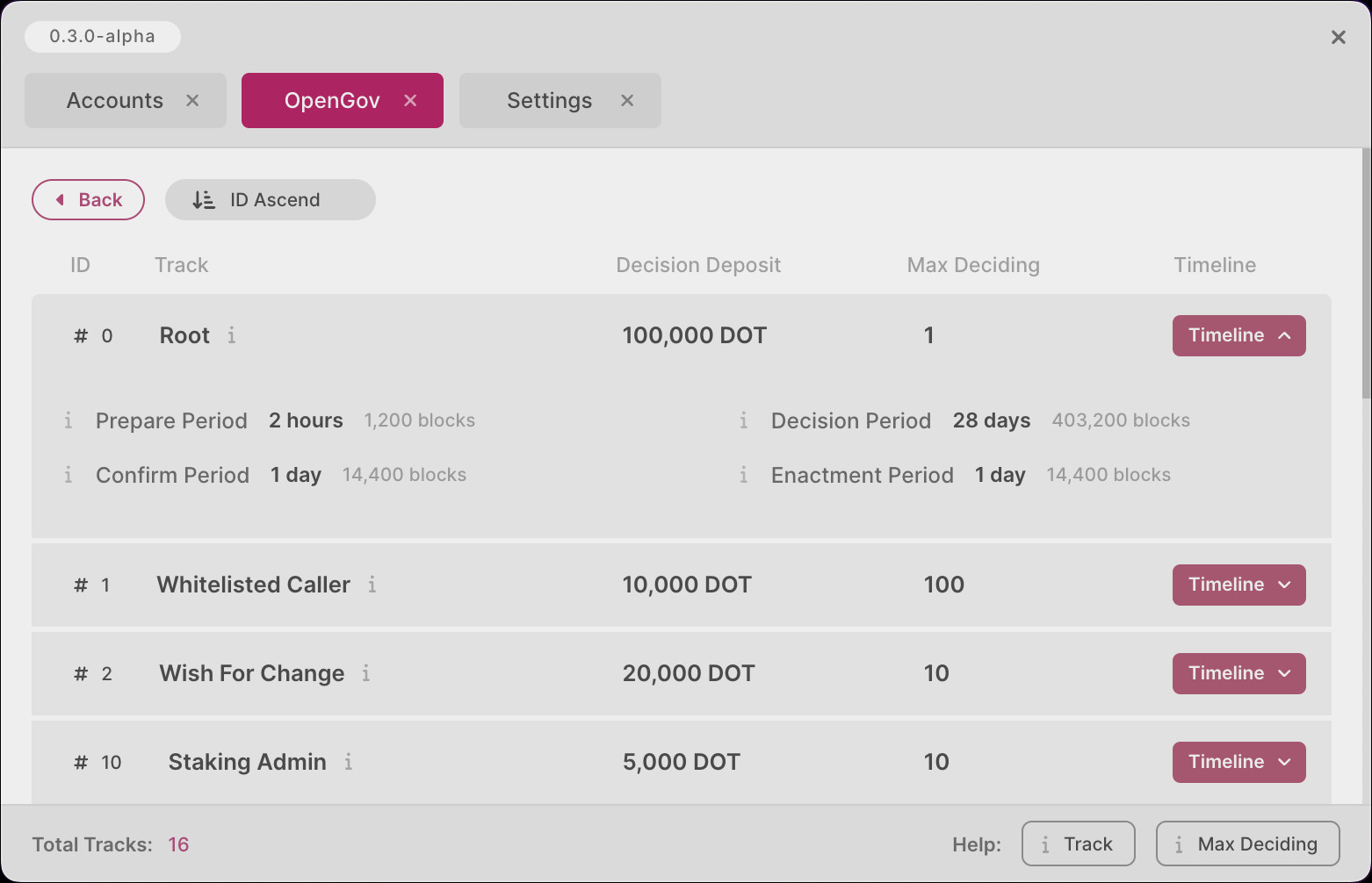
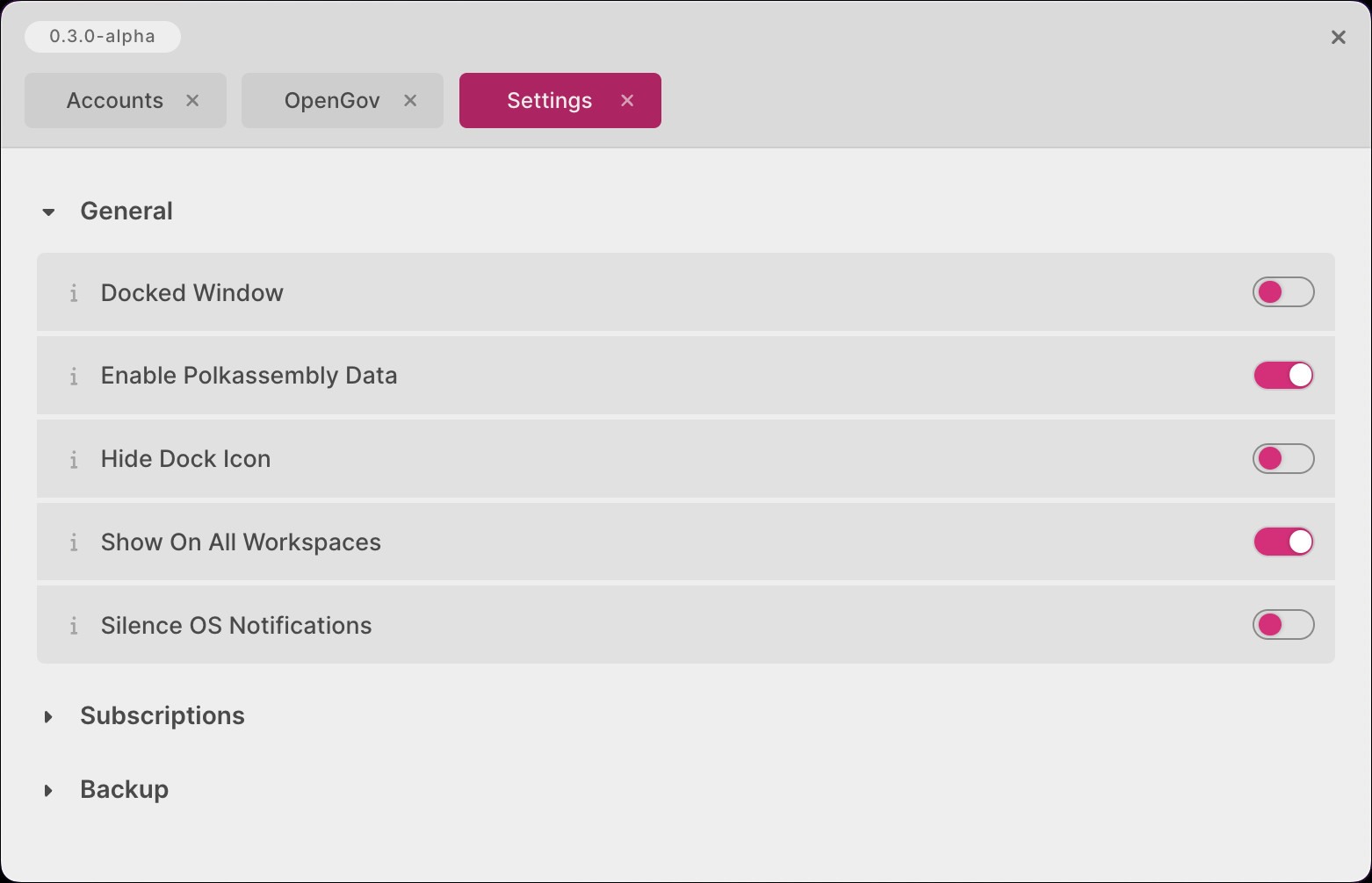
The Polkadot Live UI has been refreshed and simplified throughout the entire application. All screens now follow a standard styling convention, meaning:
- The entire application adopts a single color palette.
- Components such as buttons and cards are re-used on screens where appropriate.
- UI elements are kept minimalistic and easy on the eye.
The following screenshots illustrate how windows are now styled in a consistent manner:
Merged PRs
View Merged PRs
- feat: styling iteration #723
- feat: accordion styling iteration #724
- feat: event item styling #725
- feat: subscription screen styling #726
- feat: settings screen styling #727
- feat: import screen styling #728
- feat: open gov screen styling #729
- feat: open gov referenda styling #730
- feat: open gov tracks styling #731
- chore: styling tweaks #732
Dark and Light Theme Toggling
Description
The main window's header now houses a new toggle button to instantly switch between dark and light mode:


The toggle button will be rendered as a moon icon when Polkadot Live is in dark mode. On the other hand, it will be rendered as a sun icon in light mode. The following bullet points summarise the new theme toggle behavior:
- The default theme is dark mode when Polkadot Live is launched for the first time.
- The active theme is persisted to your installation's database and is restored the next time you launch the application.
- All open child windows will update their theming when the toggle button is clicked.