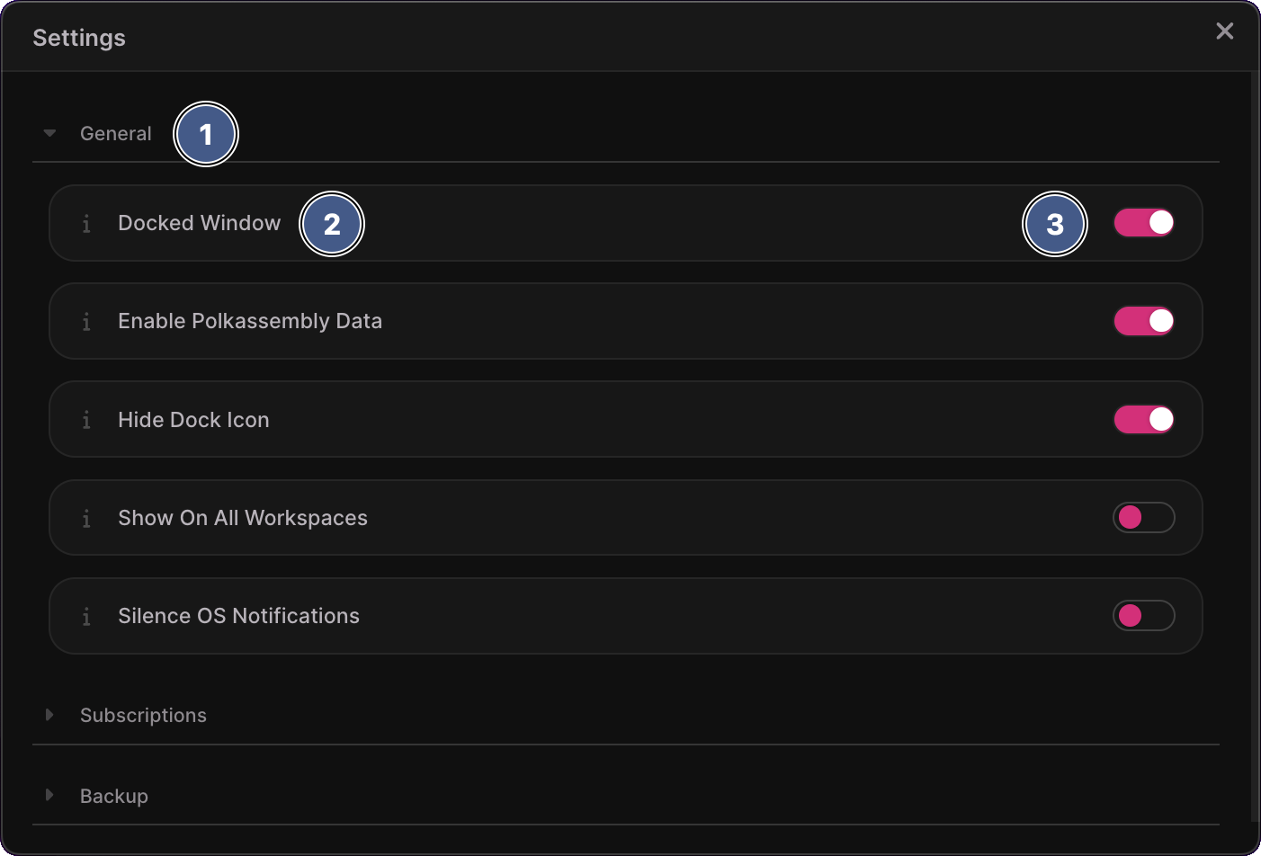
Settings Window
Overview
The settings window is opened by clicking the Settings item in the main window's cog menu. Use this window to configure Polkadot Live to your preferences. Please refer to the Application Settings documentation to learn about what each setting accomplishes.
Your chosen settings are persisted between Polkadot Live launches, meaning your preferred settings are remembered until the next time you make a change.

1. Settings category
Settings are categorized into panels which can be collapsed and expanded, simply by clicking the panel header. Note that only one settings category will be displayed at a time in order to keep UX optimal.
2. Setting title and help icon
The left hand side of a setting item includes its title and help icon. The title provides a shorthand description of what the setting achieves. Click on the i icon to the left of the title to open a help overlay, which explains the setting in more detail.
3. Setting toggle
The right hand side of a setting item will render a toggle or a button, depending on what the setting requires. Simply click on a toggle to turn a setting on or off. The application immediately reflects the state of a toggle, allowing you to see its effects first-hand.
For example, clicking the Docked Window toggle to "on" will immediately resize the main window and move it below the Polkadot Live application icon. Polkadot Live windows also communicate via port channels, meaning a window's UI can update in response to an event in another window. In this example, the docked button in the main window's header will update it's text and icon when the Docked Window setting is toggled via the settings window.